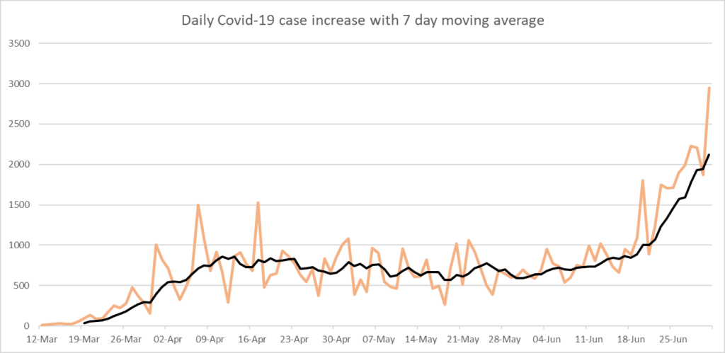
Today (7/1/2020), Georgia had a significant increase of Covid-19 cases with 2,946 new reported cases.
In the graph below, you can see the orange peaks and valleys of daily increases of cases across the start of data gathering (March 12, 2020) until the present day (July 1, 2020). These lines go up and down a lot, and usually, you will see a big peak right after a big drop. This is because, on certain days, the laboratories might not be open to report their cases, and then the next day, we will have a combination of the previous day and the current day’s reports flooding in. The same can happen if the Department of Public Health’s statistician was sick, or out. Or if something went wrong with the computers or timing.
It can be tough to understand how much something is increasing if you continuously see these peaks and valleys. If you only have the orange lines, you might wonder if this means the cases are going up, or down. Because this is very hard, statisticians like to graph something called “a moving average.” You can see an example of this in black in the graph below.
A moving average means that it takes the past days of numbers, takes the average of those days, and plots it on the graph. For a 7-day moving average, it takes the last 7 days, adds them up, and divides it by 7. For a 14-day average, it will take the past 14 days. So, for example, we have data on COVID starting March 12. For the 7-day moving average, it needs 7 days of COVID cases: that is the reason it only starts on March 19. On the 19th, it added all the cases together between March 12 and March 19 and divided it by 7. It then plots that point. The next point, at March 20, uses March 13-20 for its average calculation. If you are thinking about it, you might realize that this indeed “moves” every day, which is why they call it a moving average.
For something like new cases of COVID, you can see why this can be handy: it provides you with an average line over time, and it knocks out these big peaks and valleys to the average over a period of time.
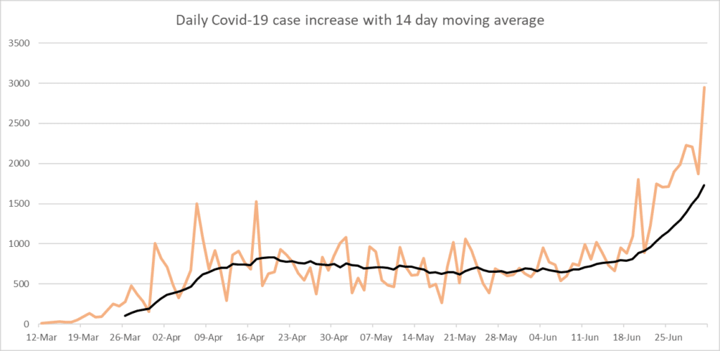
You could also plot the same data with a 14-day moving average. Can you guess what would happen?
The black plot would then start 14 days after the 12th, and you can imagine that it will flatten the little peaks and valleys of the 7-day moving average even more. I did this for the same data below. It might be hard to notice at first. You will notice it starts on March 26. Another big difference is that the first peak is not as high. The third big difference is that the last part does not reach as high. This is normal because the cases in the past 14 days were lower on average.
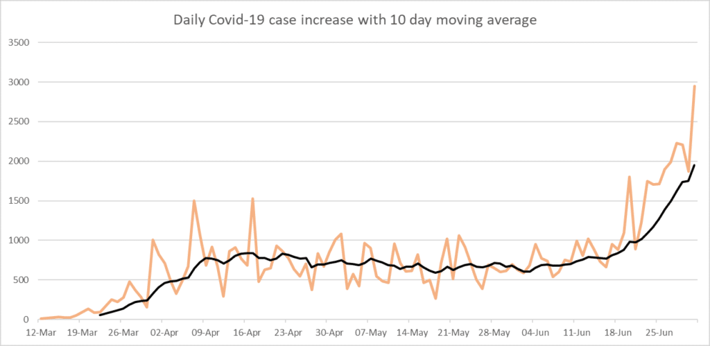
You might wonder if there are also 21-day moving averages, or perhaps 10-day moving averages, and yes, you can make it anything you want. We use multiples of 7 because we have 7 days in a week, and this means every day is in the series once, twice, etc. For COVID cases, this can be very important: we know on Sundays a lot of laboratories close, so they cannot report. If we used a 10-day moving average, it would include Sundays twice sometimes, and sometimes only have one Sunday. This would cause little dips whenever you have a 10 day period where two Sundays are incorporated. I tried this to satisfy your possible curiosity. Notice how it softens the peaks and valleys a little, but that every few days, the valleys are actually deeper? Those are when two Sundays are incorporated or, in one case, even two Sundays and a holiday. For that reason, we generally use multiples of 7 for moving averages of days.
You can imagine that some things do not use a weekly schedule as we do: a bee does not care that it is Sunday when it goes to find a flower, for example, so logging a 7-day moving average might not be as useful as using the weather patterns.
But in general, and especially for things that need humans to log the numbers, we will use a multiple of 7 for a moving average.